Saturday, 3 May 2014

Fix Internet Explorer security, even for XP - & a trap to watch out for


You should have heard there's a security hole  in Internet Explorer versions 6 to 11 (ie most modern versions), a fatal flaw which could let attackers plant malware on your PC. This zero day vulnerability, announced by Microsoft a few days ago, was considered serious enough that the US and UK authorities issued warnings about it, as did the EU security agency ENISA.

To their credit, Microsoft in short order released a fix for this critical issue - even for browsers running on Windows XP, for which support has now ended generally (so if you're still on XP, for the sake of your security you should move off it ASAP).

How to update your Internet Explorer for the fix? Use Windows Update. For many people you'll be prompted to type 'Windows Update' in your Start menu search box.

There is one trap you have to watch if you have your Windows Update settings set to 'Check for updates but let me choose whether to download and install them'. (I use that setting because Windows updates have been known to stop computers from starting up altogether! So, for non-critical updates, I usually wait a few days and search to see if there have been cries of despair online about failure or inability to boot after the new update, before I apply the update to my own computers.)

If you have that setting for Windows Update, after you check for updates you MUST click on '1 important update is available'  (or '2 important updates'. or whatever it says):

WUimportantUpdate[3]

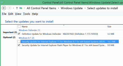
When you do that, you'll see the list of important updates. Now here's the important bit: on my Windows 7 and Windows 8 computers, often items in the list of important updates are NOT ticked by default. You have to manually tick them. This is what happened to me in the case of the critical Internet Explorer update on Windows 8.1. The option was not ticked!

WUunticked

So you must tick all the important updates, especially that one. Then you can go ahead and click all the 'Install' / 'OK' buttons, and restart your computer when prompted.

I've noticed this happen many times with Windows 7 and Windows 8 Windows updates. Also, important updates like Microsoft Security Essentials or Windows Defender are often listed under 'Optional' updates rather than 'Important' updates, so you must go and check your Optional updates too, which is not good. I hope Microsoft fixes it so that security updates, especially critical ones, are all TICKED by default without users having to check, and that security updates are all under the 'Important' rather than 'Optional' section.

Friday, 2 May 2014

Firefox 29 for security - but fix 29's terrible interface


Update your Firefox to version 29 to address a lot of security issues. It also seems to be faster and using less memory, at least on my Windows 7 computer.

But, but - v29 has a horrible 'new look' interface which is hard on my ageing eyes, especially with multi-row tabs, and the rounded edges take up more space so I have more rows of tabs than I did, plus they took away the status bar that previous versions removed but which I got back as an add-on bar with Status4Evar.

So thank goodness for the Classic Theme Restorer add-on (via this article)! Install it, that's the best tip you'll get this month.

Steps to make Firefox 29 usable(ish) again:

  1. Update Firefox
  2. Install Classic Theme Restorer (how to install Firefox extensions) and change its settings as you need (see later)
  3. Restart Firefox
  4. Rightclick in the empty area beyond the last tab and choose Customise, then
    1. move icons back down to the status bar as necessary eg NoScript, Status Text (which is the status bar text displayed to show progress when visiting a webpage, the URL when you hover over a link etc)
    2. click on Title Bar at the bottom left if you want your title bar back
    3. click Exit Customise.

(Alternatively, use Firefox ESR so that you can get the security updates without the abysmal new interface.)

There seem to be more tweaking tips but I didn't need them. Installing Classic Theme Restorer gave me back clean sharp edges and my status bar! The Class Theme Restorer options I used (accessible from the Tools menu or the Add-ons page in the usual way - Ctrl shift a is how I usually get to it):

  1. Classic Toolbar Buttons, bottom left
  2. under Tabs I picked 'Squared tabs (classic)' - just tinker with the options… 

I didn't need to do anything else except check and change the width of tabs in TMP, and move icons or boxes back to the status bar at the bottom. Do donate to the developer, who very well deserves it.

Rant time. I still prefer Firefox to Chrome because of the lack of MRU tab switching in Chrome (TabMixPlus is THE best Firefox extension ever ever, I donate regularly). But in recent years Mozilla have been making the Firefox interface more and more unusable, it seems without thinking or caring about accessibility or usability or indeed bothering to listen to users. Prettifying it with rounded edges is not always best, particularly at the expense of accessibility. I like minimal but I like clean sharp edges more, and hiding too many things is a pain as users need information beyond the minimal (so a status bar is indispensable for a start). Someone on Slashdot put it well, it's just UX as 'an excuse for taking control from the user'.

There's also a cognitive and informational cost, beyond the learning curve associated with a changed interface - the new rounded tabs take up more rows as well as horizontal space tan the old interface (ugh smudgy kiddie look), and overlap so that I can't see what pages some tabs represent. (With version 28 I used TMP with short tab widths so I could cram more tabs onto one line but see what they are from the favicons.) It's ridiculous that, to get back workable interfaces, long-term Firefox users have to resort to third party add ons (which may break with new versions, like Status4Evar did before installing Restorer). What *&!@#£ came up with putting 'the icons/buttons you want to see all the time on the top toolbar'? Most of us have stuff we want all the time, AND separately stuff we need to see only occasionally. There's just no space on the top toolbar to put both, and I refuse to scroll horizontally, so I have to have a status bar! (That's why I still use a Quick Launch bar, in Windows 7 and Windows 8 - all my most used programs are there at glance, and the start menu, which takes one more step to access, is for the second-most used set.)

Changing aesthetics for the sake of it is fine, but not when it affects usability and productivity and takes away user choice. And why make users choose between security and usability? I resent having  an abominable unworkable accessibility-unfriendly interface forced upon me just in order to keep my browser secure. If Chrome had MRU switching and all the extensions I need (particularly Zotero and security ones like NoScript), I would seriously consider switching despite the privacy concerns and some security issues.

Mozilla, please get your act together and give users back their control. Though I doubt they'd listen to me when they don't listen to countless other users rather than 'UX designers' who may not use Firefox as much as us real users who need Firefox to do real work.