Saturday, 31 July 2010

Zyb closing TODAY - save your contacts


Online contacts backup & sync service Zyb is closing down today.

Zyb were taken over by Vodafone and unfortunately on their home page the URL of the new service is obscured in some browsers in some resolutions, see top right below! (nor is the info shown after you login):

So if you want to continue with Zyb here's the URL you need to register on (for free): www.360.com (actually http://www.vodafone360.com/). See Vodafone note on this.

If you don't want to sign up with Vodafone, here's a tip: as the zyb-import people (whose software enables Zyb contacts to be imported to Android mobile phones) kindly pointed out, my previous blog post has instructions on how to get your contacts into and, more importantly now, out of Zyb. My method's phone-agnostic, it's not just for Android cellphones.

Tuesday, 27 July 2010

Secure your computer against Windows .lnk shortcut zero day vulnerability


If you use Windows, you should install anti-malware vendor Sophos's free Windows Shortcut Exploit Protection Tool ASAP - so called because a recently discovered "zero day exploit" enables attackers to use Windows shortcut link files (.lnk files) to run malicious code on your computer when you visit a dodgy website, open a dodgy document, plug in a dodgy USB stick (or open an infected folder on your network, load a dodgy DVD or CD - you get the drift, anything that gets Windows to display the icon of a manipulated file).

You don't even have to click anything to get infected. Bad guys have been having a field day with this security vulnerability but unfortunately Microsoft haven't issued a full fix yet (their suggested workaround blanks out your Start menu shortcut icons), so kudos to Sophos for announcing the provision of their free tool to block the exploit from running on your computer.

Just check your computer for malware first (there are free tools to do that, e.g. NOD32 ESET and Microsoft's Security Essentials), then download the Sophos tool and run it (or click the link and click Run) to install Sophos's blocking tool. Sophos say it won't interfere with any existing anti virus software.

Here's a Sophos video with more info about the problem.

Friday, 23 July 2010

Sit less, live longer - try online timer?


No matter how much you exercise, the more time you spend sitting, the higher your risk of dying prematurely. Sitting for long periods is seriously bad for your health.

It seems that if you want to live longer, not only should you do physical exercise, but you also need to cut down on how much time you spend sitting down. Even just getting out of your chair for a short stretch or brief walk, or just standing up for a change, can make a difference. Indeed sitting for 3 or 4 hours continuously can trigger negative physiological changes in your body. See e.g. articles in New York Times ("a study of people who sit for many hours found that those who took frequent small breaks — standing up to stretch or walk down the corridor — had smaller waists and better profiles for sugar and fat metabolism than those who did their sitting in long, uninterrupted chunks"), USA Today, Daily Mail, and ThomasNet (with more links).

I'm blogging this because further research in the US has just confirmed the same thing recently - "If you sit all day, you are in real trouble even if you exercise regularly". "Researchers say time spent sitting was independently associated with total mortality, regardless of physical activity level. They conclude that public health messages should promote both being physically active and reducing time spent sitting."

That means you, office workers, coders, gamers and inveterate surfers and film / video or TV addicts alike! And that means me too, of course.

So what to do?

Suggestion - use online timer

To help make us get up from our chairs from time to time, here's a tip: try using an online timer alarm. It'll be better for the back as well as health generally.

I've surveyed a few free online countdown timers, and my personal choice is Timeme.com (go straight to Timeme review and howto):

  1. Set your browser to autostart (how to add it to Startup folder) so it launches automatically when you turn your computer on, and
  2. Set Timeme (or other online timer of your choice) to be your browser's home page. (How to set home page: navigate to the site you want, then click "Use current" in your settings - in Internet Explorer it's Tools > Internet Options > Home Page; Firefox Tools > Options > General > Home Page; Opera Tools > Preferences > General > Home Page; if you do this with a blank page already open in a separate tab, your browser will open automatically on both a timer page and a blank page you can surf in.)
  3. Then, just remember to restart the countdown when you get back to your desk, if you've left the room while it was still counting down. And remember to pause it or stop it if you're leaving your desk at work or it may annoy your coworkers if it goes off when you're not there to shut it up!

You can install a timer application on your computer instead, if you prefer - but lots of us spend more time sitting at a computer at work, and most workplaces I know of won't let you install any software on their computers, so a browser-based solution seems to be the best (assuming the computer is connected to the internet, of course). I do briefly mention some downloadable software later, just for completeness.

Online timers - review

So, here is a round up and short reviews of the online timers I've found which seem most suitable for regularly prompting us to get out of our chairs.

For all of these, you just have to:

  1. have your web browser open on the right page (even better, set it as your browser's start page see below), and
  2. where appropriate (this is with all of them except TimeMe), click the Start or similar button on the webpage to get it going for the day.

To hear the timer alarm go off, with the services I've picked you don't need to be viewing the browser tab displaying that page. You could be browsing in another tab.

You don't even need to be in the same application - e.g. you could be doing some word processing or reading your email, or even surfing using a different browser; the timer alarm will still go off, just as long as you've left the timer tab open in your browser in the background.

Of course you won't hear it if you're not in the room, so I repeat, if you leave the room (which means you've gone and got up out of your chair, pat on the back), when you come and sit back down you need to remember to re-start or reset the timer again.

None of the online services I found is perfect for what I have in mind, but I'll give the pros and cons of each.

Here are my criteria. To remind me not to stay seated for too long, what I really really want is an online Web timer which:

  1. webpage, with autoload - comprises a webpage you can set as your browser home page, so that it loads automatically when you first open your browser, and which you can save as a bookmark or favourite too
  2. alarm - plays a sound every say 30 or 45 minutes, to remind you to get up and move around, stretch, have a short walk etc (a popup window that takes focus even if you're in another application would be a bonus)
  3. makes you get up! - plays the sound continuously until you manually stop it, so that even if you're engrossed it forces you to get up off your butt and do something about it. Maybe with a backstop at 2 minutes so that it doesn't go on forever if you're not at your desk, like car alarms are supposed to have at 20 minutes (but sometimes don't!)
  4. restarts count automatically - when you click (or, I wish, press a key?) to shut it up, it should automatically start the timer countdown running again, so it'll sound again in another 30 or 45 minutes or whatever. One button to do it all. You shouldn't have to stop it and then click Start again, otherwise people will forget to click Start again.
  5. choice of interval - lets you choose the interval you want between timer alarms, e.g. 30 or 45 minutes, but won't let you choose more than 1 hour (maybe 2 hours? Don't know medically what the recommended longest time you should spend sitting still is). Choosing 7 hours would defeat the object!
  6. pause and restart functions - lets you pause the cycle and resume it again, or even restart it from scratch, e.g. after you've popped out to the little room.
  7. choice of alarm sound - lets you select the sound you want - horn, siren, horses neighing, whatever…. Ideally either on the site or, for those who prefer it, a sound file from your their computer e.g. MP3 or WAV.

So here's my shortlist of free online timers that come close to what I want for this sort of use.

Remember, none of them meet all 7 of my criteria. So if anyone builds or knows of something which does, please let me know!

1. http://timer.onlineclock.net/

Pro

Alarm won't stop until you manually click "Alarm Off". Which is what we want to make us get up!

Con

  1. After it goes off and you click Alarm Off, you also have to (1) click "Back to Timer" and then (2) select the countdown time afresh, to start it going again. Extra steps which some may forget.
  2. No choice of which sound to use.
  3. Sounding till you manually turn it off can be a con if you're not at your desk when it goes off - it could drive your co-workers crazy. So remember to set it to Off via the dropdown if you get up from your desk while it's still counting down, and then to restart it when you get back.

Try Online Clock timer. The developer has kindly said he'll look into making the cycle repeat automatically on clicking "Alarm Off", when he has time.

2. Java timer

Click "Count Down", choose hours/minutes/seconds, then click Start.

Tip: if you don't like the label "Tea Timer", click on that label and type what title you like instead, then hit Enter or Return (or click anywhere outside that area). If you mistype you can't backspace, but just click on the name again and re-type it.

The code is from http://javaboutique.internet.com/JavaTimer/ and is available online on various websites such as (click one of these links to try it, it's the same on each):

Pro

  1. It remembers your previous setting e.g. x minutes, as long as the browser remains open, so (unlike the previous service) you don't have to re-select the countdown time, so after the alarm sounds you can just click Start to restart the timer (and stop the alarm sounding).
  2. Alarm sounds for a decent length of time too.

Con

  1. Every day, the first time you go to the webpage you have to click "Count Down" and then choose the number of minutes afresh, to get it going. Some may forget to do that. Similarly the "Tea Timer" title - your changes aren't saved.
  2. You have to click Start to restart it each time after it goes off. Again, some may forget to do that.
  3. The alarm stops after a few seconds so you might ignore it and forget to stand up.

3. TimeMe (via Vicki Blackwell)


  1. Click the Timer Stopwatch Settings link, then (see pic above):
    1. Choose your Alarm sound. Tips:
      1. go for Horn (sounds for longer and is the most insistent, to me) or Beep (loud-ish, but too short in my view)
      2. don't use "Pop Up" - that only plays a sound if you're still viewing that tab, or are in another application; if you're in another tab of the same browser, the alarm won't go off. Also you have to OK the popup before the timer will restart the loop.
    2. Tick Auto Start (so the timer automatically starts counting down whenever your browser opens that webpage e.g. on startup)
    3. Tick Loop to repeat the timer automatically; choose Sound (you can preview them) then
    4. click Save.
  2. It goes back to the main page (see pic below). Just click Stop if necessary first, then for Start Time enter 00:30:00 or 00:45:00 (for 30 or 45 minutes respectively) or whatever timer interval you prefer (you can leave the Stop time at 00:00:00), then click Set. That automatically starts the timer going as well.
  3. Note that:
    1. The "Stop" button actually pauses it (and you can click Start again to continue).
    2. "Reset" button restarts the countdown from scratch, e.g. if you've got up for a cuppa, you can give yourself a pat on the back and start the 30 minute (or whatever) countdown from 00:30:00 afresh when you get back to your seat.
  4. Every time you visit that page (unless you've deleted your cookie) it'll remember your settings.

Pro

  1. Very customisable, including Loop to repeat the cycle automatically (hooray!).
  2. Your settings are remembered on the computer with a cookie. If you delete cookies, this'll go unless you remember to preserve the cookie for this site. But you can always redo your settings.
  3. Choice of different alarm sounds which you can preview.
  4. "Stop" button to pause is good, as is having a "Reset" button to restart the cycle
  5. Decent help page.

Con

  1. Alarm only plays once through, not continuously until you stop it. Good for your colleagues, not so good to make you get up!
  2. If you use a different computer you have to set up your settings afresh on it. A very minor disadvantage considering most of the others won't save any settings at all.
  3. The alarm options are mostly too short (Drums) or too soothing (like Clarinet and Sonata) to make you get up! Phone is too confusing. Which is why I think Horn is best, it's the loudest and plays for the longest time.
  4. With browsers other than Internet Explorer you'll have to install QuickTime plugin in order to hear the alarm - e.g. for Firefox.
  5. It seems to have paused itself once, in my testing. Maybe it was me, but the button should have read Start after a manual pause, and it didn't, yet it wasn't counting down..

Try TimeMe.

4. Online Stopwatch/Countdown

Quite sophisticated when using the Custom option. And certainly the most Web 2.0, with the ability to add their widgets to your blog or website, Facebook, gadgets for iGoogle etc.

The settings I suggest are as follows (you can test it by picking a short countdown).

  1. See pic above - just select "Just the Countdown Timer", pick your alarm sound, pick "Ring until canceled", and I'd go for "Always start the timer at" and enter e.g. 30 minutes (00:30:00) or 45 minutes (00:45:00).
  2. Then click "Get Link to Countdown Timer", and click or save the link in the blue box that appears - that's the link you want to use for your home page or favorites in future, which goes to the custom webpage they'll set up.
  3. If you've chosen "I will set the time each use", after clicking the link to the timer webpage you'll have to click the number buttons to set the time, then click Set and Start. And each time you go back to that webpage you have to do that too. Which is why I prefer

Pro

  1. Sets up a special webpage you can access from any computer over the internet, with your chosen settings.
  2. Alarm will keep going until you click "Clear" (if you use "Ring until canceled" as I suggest), so you'll have to pay attention!
  3. Good selection of sounds, which again you can preview. The alarms are good and loud too (though "Siren" may cause a real stampede. I like Submarine, Air raid siren and Original bell for being insistent without being too piercing, although Horse race bugle call is rather fun, and "Applause" may reward you for being a good healthy thing and getting out of your seat for a bit!)
  4. Pause button available (Start becomes Pause after you click it), which becomes Cont when pressed.

Con

  1. You have to remember to click Start when you first open your browser, to get it going every day.
  2. Every time it goes off and you click Clear, you then have to click Start again afresh for the next time.
  3. There's a Pause option but no Reset (unlike TimeMe). Tip: just click Clear and Start to reset.
  4. As with Online Clock, the fact that it won't shut up till you manually click Clear is great if you're at your desk, but bad if you left and forgot to turn it off as it may annoy your colleagues, so you need to remember to turn it off if you get up! And restart it when you get back.

Here are some pages I made earlier, if you want to use them - remember you have to click Start each time after you click Clear, as it won't repeat the cycle automatically (if you try the links below, on this occasion please ignore the arrows, don't click on them, just click the links; and use the Back button on your browser to get back to this page, not the Back button on the webpage):

Try Custom Countdown.

Desktop alternatives?

Online Stopwatch also offer a free basic Windows download which will "stay on top" of your other apps, plus other more customisable SWF downloads for Windows and Mac, all of which hopefully you can download and run stand-alone on your work computer even if your IT department won't let you install software generally.

You just doubleclick the downloaded file to run it, and you're not installing anything, so hopefully your IT department won't come and wag their finger at naughty you - but it's best to check with them first.

Note that the SWF files need Adobe Flash Player installed to run, which you may or may not have on your work computer; the "stay on top" doesn't, but it's Windows only, and is not very customisable.

XNote Timer (again via Vicki Blackwell, NB it's the Timer not the Stopwatch) for Windows also runs stand alone, again without needing to install anything; it's free to try though they ask for payment if you use it, it lets you use your own sound files, you can tick "Restart the timer" to keep it going round and round, you can even set hotkeys to start, stop or reset it, yay.

But, there's no Pause, and more importantly you can either get your sound file to keep playing continuously (which is what the Loop option here does, confusingly) till you hit Stop, or you can have the cycle automatically restart - but you can't have both. So either tick Loop to keep the alarm playing, then click both Reset and Start each time it goes off; or else, use "Restart the timer" and remember it'll go off once but it won't nag you continuously till you deal with it. Tip: click More, pick Timer; to change the options e.g. sound file, interval, you should change to Stopwatch then change back to Timer.

Verdict

I'm lazy, so I like TimeMe - it's got good options which involve zero work once you've set up your options and browser home page; then you just have to remember to launch your browser (not even that if you autostart your browser on startup). None of the other online timers will restart the countdown cycle automatically when you stop the alarm sounding.

I just wish TimeMe also had an option to make the sound keep on playing continuously till you shut it up (while still repeating the timer cycle). Then it would be perfect for making me get up out of my seat! I guess one loud honk will have to do me for now.

The TimeMe people told me they do have that option, but not for the free version. You have to get the paid version if you want that.

One day maybe we'll have chairs that'll give us a good prod (or electric shock?!) and physically tip us out of them at regular intervals. 'ealth & safety, innit? But not for some time yet, I suspect. (Meanwhile, if you're looking for a decent chair to try to save your back, see my computer /office chairs review.)

Wednesday, 21 July 2010

Nokia N900 mobile phone review - for developers & consumers


I received a Nokia N900 cellphone a few weeks ago to test and return, thanks to James of WOMWorld. I was asked to look at it primarily from a developer's viewpoint, but I'm going to consider it for both average users and developers. First developers, then users.

Now if I'd had an N900 unit to play with when the phone first came out in the UK last year in Q4 2009, my review would probably have comprised raves unlimited.

The N900 is a very nice phone indeed, an extremely solid bit of kit, and I personally much prefer a smartphone with a physical keyboard than one without - it's much, more more practical than a soft keyboard, and certainly a whole lot faster for email, tweets, texts, documents etc. Highly portable device with physical keyboard, yes yes, I'm still waiting for something that can even come close to the Psion 5mx (which uses EPOC32, Symbian's big daddy - see Wikipedia on the 5mx).

Furthermore, the N900 uses the open source Linux-based operating system Maemo, which can run the excellent free open source Firefox browser, aka Fennec on mobiles. (Firefox is my favourite browser, oh if only it were as fast as Opera.)

However, news came out in April and May 2010 which might give some pause. What news? First, in April Nokia announced that the open source MeeGo operating system would merge Maemo with Intel's open source Moblin OS. Second, in May Nokia said:

Many of you have been asking whether the new MeeGo platform will be supported on the N900 once it’s device-ready. Although Nokia N900 devices are being used for platform development and testing purposes by those involved in the MeeGo project, Nokia doesn’t have plans for a full scale commercial MeeGo upgrade on the Nokia N900. The reason? It’s really about ensuring that you have the best possible experience designed for the features on your Nokia N900 device. Nokia realises this news may be a disappointment for some, rest assured that Nokia will continue to support the core Maemo software on your Nokia N900, as evidenced by the PR 1.2 (V10.2010.19-1) update available today.

Developers

So, this means that N900s won't be officially upgraded to MeeGo and the N900 will officially remain on Maemo, a platform which realistically Nokia won't be putting as much into in future.

This discussion typifies the kinds of misgivings which those announcements have triggered.

Now it's good news that Nokia have said they'll still support Maemo on the N900 (otherwise they might have had a riot on their hands!).

But surely that's not going to be their core focus - they're inevitably, and understandably, going to be concentrating more on their key strategic areas for the future, namely MeeGo (and presumably Symbian).

Which doesn't seem so good for those who've forked out on a far from cheap bit of gear, and seems doubly strange given that, as Nokia noted in their quote, the N900 has been used a lot by MeeGo developers and testers.

Maemo has a thriving community of developers and users, including some very helpful developer guides and support fora e.g. SDK installation documentation. But one can appreciate from a business viewpoint why Nokia decided to go the MeeGo route.

What may make less sense at first is why Nokia decided not to support MeeGo officially on the N900. No doubt it would cost them resources to do so, but surely not officially updating existing N900s to MeeGo would cost them in user loyalty (and even more in already low sales) - perhaps unquantifiable, but still probably significant.

(I know full well just how that feels as a user, having had a T-Mobile UK G1 Android smartphone - just over a year old, but it seems T-Mobile UK aren't even providing customers with version 2 of the same operating system; their tech department claim the upgrade is up to HTC rather than T-Mobile, whereas conflictingly their customer services say T-Mobile have just decided to postpone it to some unknown indefinite future date to tie in with other moves! I shall be leaving T-Mobile as soon as I've time to sort something else out. Not just for that but for the often (not always, but usually) terrible customer service too. And yes, I can upgrade the G1 myself, and I will. I was just curious to test how well T-Mobile deals with such queries and looks after their existing customers on a continuing basis, and from my own experience it seems that they don't really care that much).

On the MeeGo front, however, things are not as bad as they might appear, and the MeeGo news shouldn't put developers off completely from the N900.

Why? Because, unofficially, there is MeeGo for the N900. Lots of developers, including Nokia employees, have been working on that. MeeGo 1.0 was released towards the end of May, including MeeGo for the N900 (e.g. installation without erasing Maemo 5; and images) as well as for netbooks etc.

You of course have to know what you're doing in order to unofficially install MeeGo on the N900 (as a blog post with a video of the installation pointed out pithily, "If you need this video to install MeeGo on N900, you should NOT be installing MeeGo on your N900"!). Obviously, developers wouldn't have a problem MeeGoing their N900s, but most average users would.

And remember if you install MeeGo on your N900 you can say goodbye to any official Nokia support, although no doubt developers won't be too bothered about that, and there's the MeeGo community.

So for developers now might indeed be a good time to pick up an N900 on the cheap, but with an eye to the future it would seem more sensible to focus on MeeGo rather than Maemo. With some work, the N900 is even Androidable to some extent…

Nokia (and Intel) really need to think hard about how they're going to attract developers to MeeGo instead of the Googlified and equally open sourced Android, and, just as importantly, how to get them to stay with MeeGo longer term, given the highly competitive state of the current smartphone market - and I'm not just talking Android or iPhone, Microsoft seem to be doing a great job winning even hardcore Linux developers over to Windows Phone 7.

Consumers

What about the (non-developer) consumer's viewpoint? As I mentioned in my blog post on the MoMo session on the implications and difficulties for developers of there being so many different mobile phone platforms, the position for consumers is not unaffected by the position for developers, especially in relation to smartphones - because if developers don't want to produce apps for a platform, then users will obviously have fewer and more expensive apps to choose from.

There's also the slight question mark over ongoing support for Maemo which might worry some people, even though Nokia have said they'll keep updating it. On the other hand, a lot of people who go for smartphones probably change their phones every year or two anyway, so this may not be an issue for them, and there are certainly still enough apps available for Maemo to keep most people happy for a while.

A final issue I've heard about is this - it seems that simply in order to update phones that they have already paid for, N900 users are being forced to sign up to MyNokia, with texts automatically going from their phone (at their expense) sending their personal data to Nokia. Many N900 users were (as you can see from the comments) very concerned about it, and I understand some still are. Yes you can opt out (Settings > MyNokia), and Nokia aren't the only business to do this, e.g. to use Android phones properly you are forced to have a Google account, but it's a question of advance notice and transparency, and changing the goalposts on people after the event (or being perceived to).

In these increasingly privacy and consumer rights-conscious times, it's important for businesses to remember that anything which can raise data protection or privacy issues, or which apparently tries to restrict (after the purchase) users' ability to use fully something they've previously bought, can raise hackles at best or result in being sued at worst - as Google found out with Buzz, Sony with the Playstation "downgrade" (and litigation), and Amazon with the Kindle and 1984.

Even the fact that you have to register before you can download any apps from Nokia's Ovi Store will put many people off - and surely Nokia want to promote the benefits and encourage the use of their store? (Tip - you can install Firefox to your N900 direct from Mozilla without having to go through Ovi; and the Maemo site is fine.)

Developers haven't been too happy about Ovi either, notably the lack of push updates - see my write up of the Mobile Monday multi-platform event.

So Nokia have to be very careful how they manage this sort of thing, reputationally, and be much more aware in future of these issues, in advance, before they do anything similar again - whether with the N900 or anything else. And improving Ovi generally would help too.

N900 and G1


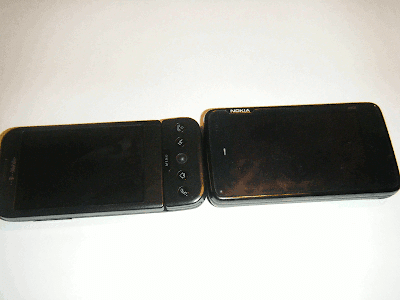
Moving on, here's a brief (for me!) user-perspective comparison of the N900 against my G1, as it's similar in that the G1 uses the (also open source) Android operating system and has a physical keyboard and touchscreen. Pictured above side by side, N900 on the right, keyboard open and then shut.

  1. General - N900 feels a lot heavier in weight. I wouldn't want to have extended conversations on it without an earpiece, as I'm feeble and can't hold heavy objects for long without getting tired and I do find the N900 a tad heavy personally.
  2. Keyboard - N900 keyboard is much smaller as you can see above, but interestingly I found it much faster and more accurate in use than the G1. Probably because Nokia really know what they're doing on the hardware design front. And the N900 doesn't stick out on the right between keyboard and hand. But, I really missed having a Menu key and a Back or Escape hard key. (Tip: to get out of a menu on the N900 you tap outside of it.)
  3. Phone use - an example of better design is, you can set it up so if you hold the N900 portrait style up to your ear, it automatically just goes into phone mode, a thoughtful and clever touch. Whereas with the G1 it takes a tap or two to get to the dialler screen. Conversely though, when switching from landscape to portrait mode on the G1, the screen automatically follows suit, but not on the N900. The pull out stand to prop the N900 up at an angle facing you is a nice extra.
  4. Screen - for someone used to the G1, the N900 takes a bit of getting used to. Scrolling, especially (even though it seems like it would be similar); it's the different timing of how long you have to hold things down for, etc, especially when using fingers not stylus (yes it comes with one but I don't like using styli (styluses?), too easy to lose). So the N900 didn't always do what I wanted or expected (based on my G1 experience), especially in the browser when it would often zoom instead of opening a link or vice versa, but once you figure it out it's mostly fine if sometimes still erratic. If in doubt, press & hold the screen & see what happens, and try holding first then swiping (not just a straight swipe). Tip: even when there are more menus available underneath, there's no clear indicator of that. Just hold-swipe & see.
  5. Gmail etc - as a heavy user of Gmail and Google Calendar, I missed the Android integration with those Google services (including my contacts) once I didn't have them, which you don't on the N900. Entering username/password details on a phone, even one with a keyboard, is a pain. (I secure my phone by requiring a password on first switch on, which is my security compromise.)
  6. Speed - N900 seems faster than the G1 for surfing, especially with Firefox. Even using the same SIM & network.
  7. Battery life - again, N900 seems better than G1 although to be fair I didn't install that many apps. It also has a physical lock to stop it turning itself on if you inadvertently bump into something, aas happens too much with my G1, making its poor battery life even worse. The G1 that is, not the N900. Again, a nice attention to detail point.
  8. Usability - a lot of basic "how tos" are missing from the manual, and should have been included. Really I mean just operational tips for those not used to a touchscreen smartphone that works in the way the N900 does (which is different from say the Android or iPhone), e.g. how to get out of a menu without selecting anything. Just adding a few small but fundamental things like that would have gone a very long way. Although I know this phone isn't so much aimed at the average user.

Conclusions

As a developer phone the N900 is still pretty good (it is Linux), especially if you can now get one at a bargain price and MeeGo or Androidify it.

As a user, I wouldn't be too upset with the MeeGo announcements if I already had an N900 (you're no worse off than e.g. if you had a T-Mobile G1 and wanted Android version 2 - you just won't get it unless you DIY). The N900 is a very decent phone and there are going to be apps and updates for a while yet (check out Maemo apps). MeeGo being quite new, there's much more out there for Maemo currently, and as I mentioned it's possible many people would want to get a new phone before there are as many apps out for MeeGo as Maemo (or indeed before a full new MeeGo handset is available), anyway. Indeed, Firefox for the N900 on Maemo was updated relatively recently.

If Nokia had chosen to upgrade all N900 users to MeeGo for free or a token fee, that would better indicate an ongoing commitment to Nokia users and help make people feel more confident about buying Nokia phones (even though Nokia have said they'll keep supporting Maemo, it's not the same).

But as it is, for average users I wouldn't suggest rushing out to buy one now, especially given that the N900 is already a bit long in the tooth in mobile phone time (mobile phone years are, of course, far shorter even than dog years). Unless perhaps the price was really cut down.

Such a shame about the lack of official MeeGo upgrades for the N900. I actually prefer the N900 over the G1 as a device, not least because of the build quality and faster keyboard use (despite the weight) and attention to detail. I'd buy one myself if I could be assured of getting the same range of apps for it as for Android at the same sorts of prices (as I said in my MoMo post, often it is about the apps), and if there were adequate guarantees as to its continuing future support and proper OS upgrades (not to mention full easy Gmail etc integration! though there are ways round, of course). In other words, were the N900 supplied as a full blown Android phone out of the box, WOMWorld would have had a lot of trouble prising it out of my small but very grippy hands!

Friday, 16 July 2010

Windows: print list of files & folders easily


For how to print a listing of files and folders in a particular Windows directory or folder on your computer (including external hard drives), Karen's free Directory Printer is a great sophisticated tool with the ability to drill down and print the contents of selected subfolders too.

But if you only want a quick and dirty printout listing the names of the files and top level folders in one particular folder (and you don't need a list of what's inside sub-directories too), here's a tip - simply use a web browser. And, if your folder structure is not too complex, you can navigate to and get and print subfolder listings without too much trouble too.

Note that this trick doesn't work with Internet Explorer, which just opens up a Windows Explorer window showing the contents of the folder - but it works with all other popular free browsers like Firefox, Opera, and even Google's Chrome.

How to print listing of files and folders in a particular directory or folder

  1. Open Windows Explorer or My Computer and navigate to the folder you want; open it so you're viewing its contents.


  2. Click in the address bar (or hold down Alt and tap d). This displays the "real" folder address or path and highlights it.


  3. Copy the selected address into clipboard (rightclick it and Copy or hold down Ctrl and tap c).
  4. Now go to your browser (use anything but IE - try Firefox).
  5. Click in the browser address bar (or Alt d, yep that works in browsers too), then paste the copied folder address (Ctrl v or rightclick and paste).
  6. Then click Go or hit the Enter button in your browser, and the contents of the folder you want are listed in the browser like a webpage.

    Firefox

    Opera


    Chrome


  7. You can now just print the page as you'd normally do for webpages (menu File -> Print or Ctrl p).

That's it. As you can see it'll even show info on file sizes and date last modified, and you can click the links to open files or folders to navigate round some more.

Interestingly for trivia fans, what they show in the address bar is different - with Fox showing (in my example) file:///K:/My%20Documents/test/, Chrome file:///K:/My%20Documents/test/ and Opera file://localhost/K:/My%20Documents/test.

Thursday, 1 July 2010

Opera browser: how to get rid of blank space at the top


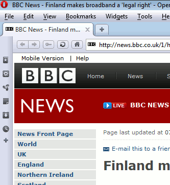
If, with the recent upgrade to the free Opera browser, you find that there's a horrid empty blank horizontal bar at the top of Opera between the tabs / windows and the Opera menus taking up precious screen space, here is how to get rid of it:
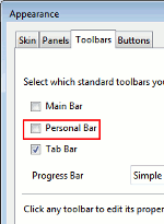
  1. Right click in it that bar or blank horizontal space and choose Customise


  2. in the Toolbars tab, make sure "Personal Bar" is UNticked


  3. then OK
  4. then you can reclaim all that wasted space, hooray!

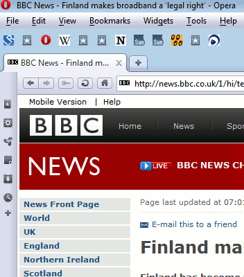
For some reason the Personal Bar, which should show some icons in it, like so:

- but somehow it doesn't always display them, and instead you see a blank as I did, which can become an annoyance and frustration if you think you can't delete it no matter what you try.

I still use Opera for some things as it's the absolute fastest browser around and, unlike Google's Chrome, it displays the webpage immediately whenever I switch to an existing tab - and most of all, it doesn't slow my Vista computer down to a crawl if I leave some tabs open then come back to the computer after having left it unused for a while. Once I discovered that Chrome was the culprit which, if left with lots of tabs open, then caused most apps on my computer to go "Not responding", freeze, hang, take forever to do anything basically, I stopped using Chrome for my main browsing. Though I'll try again an upgrade or two later.