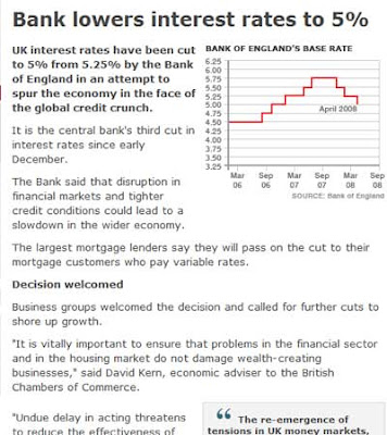
I'm a big fan of the BBC, but recently they revamped their site so that the text on the BBC News pages is now grey instead of black:

I find that very hard to read, in fact after a few paragraphs I feel like my eyesight is going. (Other pages on their site, e.g. the BBC blogs, are I find easier to read, maybe because of the dark sidebars, or the spacing between lines - whatever the reason, it feels like there's greater contrast between the text and its background). I find this particular change a bit surprising because normally the BBC are very good on accessibility.
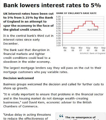
So I was going to whip up a Greasemonkey script for the Firefox browser to address this. But I see that Joe Walp has beaten me to it with his BBC News Black Text script, so obviously I wasn't the only BBC user suffering from the change. Thanks, Joe! And here's what the page above looks like with the script installed - much more readable and legible, as you can see:

So if your eyes are bad like mine, do yourself a favour and install the script!
(For those new to this: Firefox is a free browser which is very powerful and customisable. You can get add-ons or extensions to Firefox to boost its features. The free Greasemonkey extension lets you change how particular websites look when you view them in Firefox (plus a whole lot more), e.g. if the text of a favourite site seems a bit too small to you, you can make it bigger, darker etc in your browser, with the aid of "user scripts" which you install once you've installed Greasemonkey. Here's how to install Greasemonkey and userscripts.)
Tags:
No comments:
Post a Comment